Getting Started
with

This tutorial builds upon my basic Flourish Studio tutorial with an in-depth exploration of Flourish's Network Graphs templates. This browser-based application can be used to quickly produce basic network analysis graphs, also referred to as force-directed graphs or node-link diagrams.
Flourish Studio offers both free and paid options. Flourish Public is free to use, but your data and visualizations are publicly accessible. As such, if using Flourish Public, consider redacting or removing any sensitive information, and be sure you have rights and permissions to upload the data you're using. If you find you need the confidentiality of a paid personal plan, contact Flourish regarding their academic discount plans.
To get started with Flourish Public, you'll need to register a new account. As Flourish Studio is browser-based, you won't need to install any software.
Today we'll be working with a cleaned subset of 2015-2018 United States beer distribution statistics. The "US Beer Production_2015-2018" data set can be found here. To begin, make a copy of the data set, then download and save to your desktop.
Creating Basic Network Visualizations and Importing Data
Once you've signed in to Flourish for the first time, you'll see a home page with your projects. As you create visualizations, this page is where you'll be able to go back and view or edit them.
To start, click on New Visualization. ![]()
Next, choose a template for the type of visualization you'd like to create. Types of visualizations are grouped by headings. Today we'll scroll down and select under the Network Graph heading. For our first visualization, choose Basic Graph.

Now that we've selected Network Graph: Basic, we'll see a sample visualization, pre-populated with an example data set. All Flourish visualizations will come preloaded with these examples--be sure to take a close look at them prior to loading your data set. Consider, is your data formatted similarly? Are there changes you can make before loading data that might make the process easier?
To change between the visualization preview and the data set, toggle the top Preview/Data selector. ![]()
Toggle to Data to inspect the sample data sets. Columns to visualize are pulling from all three. Flourish will read the first row of your data set as headings--in this example column A is labeled 'source', column B is labeled 'target', and column C is labeled 'value'. In the tabs at the top of our data set, you'll notice your data is pulling from two separate data files, one titled 'Links' and one titled 'Points'. Although extremely basic network analyses can be created with one data file, using two allows us to further specify details of the points in our network visualization.

The first data set, Links, provides information for our visualization's relationships, connecting Source Points with Target Points. We'll be uploading the 'Links' tab of our "US Beer Production_2015-2018" spreadsheet to replace this one. The second spreadsheet, Points, provides information on each unique point within our data set. The ID category lists every unique point found in our Links data set, with Group and Size providing information for displaying the connections within the visualization. We'll be replacing this spreadsheet with the 'Points' tab of the 'US Beer Production_2015-2018' spreadsheet.
On the right side of your screen you can select columns to visualize. Depending on the visualization, the options shown here will change. For our graph, we notice that the options here are divided to account for our two data files. At the top, we have the options of Source point, Target point, and Value of link, all of which are pulling from our 'Links' data file. At the bottom we have the options of ID, Group, Size, Image, and Info for popups, all of which are pulling from the 'Points' data file.
Before uploading our Beer Production data set, play with the default data to be sure you understand how Flourish is pulling information from the Links and Points data sets.

Now that we've tested out the sample data, we'll try importing our own data set. Click on ![]()
Select the US Beer Production_2015-2018 document you downloaded earlier and select 'Import Publicly'. We'll notice that the same column selections we'd had previously are still active. As such, we'll want to change our columns to match our new data set.
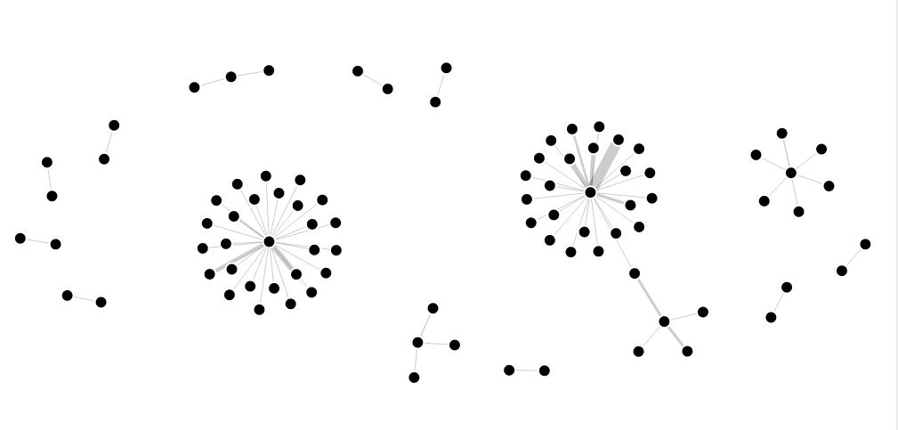
We'll begin adding connections in the 'Links' data set. For Source Point, select column A, "Brand Name." For Target Point, select column B, "Company Name." This is linking each beer brand with its parent company. you'll notice your data is pulling from three separate spreadsheets. Value of Link will set the thickness of the link between the source and target points. As we'd like to visualize the production numbers for each company, we'll choose column F. This column displays the number of liters of beer produced by each brand in 2018. Switching back to the Preview tab, notice how our visualization is beginning to come together, as shown below.

We can see our data is beginning to come together, but we'd like to add some more clarification with color, size, etc. Switching back to the Data tab, let's work on the 'Points' category.
We'll add some further connections in the 'Points' data set. First, make sure that the 'Points' labels on the right side are pulling from the Points data sheet. For ID, select column A, "ID." For Group, select column B, "Group." For Size, select column C, "Size". ID represents a complete list of all unique points in the data set. Column B represents the production companies we're linking each data point with. Size (column C) is displaying the number of brands held under a parent company. Further information, including popups, icons for different points, and more can also be added and adjusted in this section.
Conveniently, our data set is already prepared for this style of visualization. Some data sets will require fairly significant cleaning to effectively display. If at first your visualization doesn't display, go back to the basics and consider--what are the source points and target points? What groupings can be made with these points? What other information do we want to visualize? Ensuring you have carefully considered your end goal and adequately prepared your data set is crucial when working with an advanced visualization.
Now that we've got our data entered in, flip over to the preview tab to see how your data is looking. Not to worry if there are still outliers or oddities (as shown below)—we'll address that next!

Looking at our visualization, we see most data points having connections between companies and parent distributors, with one outlying solo data point. Let's investigate what's happening with this point!
Clicking on the data point we see that it's a duplicate "Labatt" point. Let's navigate to this data point by switching to the Data tab and searching for "Labatt" in the Points data sheet. Finding two results, we see that Labatt is duplicated in the Points data sheet.  As the ID category in the Points data sheet shoud represent each unique identifier only once, having multiples is leaving us with an outlier. Although Labatt is linked to two distrubutors (Florida Ice & Farm and Anheuser-Busch), we'll remove one. With Florida Ice & Farm being the main holding company for Labatt, let's delete the second entry of Labatt linked with Anheuser-Busch (Row 9, points data sheet). Switching back to the preview tab, notice how our visualization has changed!

Now that we've fully cleaned our data, let's focus on revising the rest of our visualization. We can adjust the look of our network analysis by toggling on or off many of the available options. Switch back to the Preview tab to begin making these revisions.
Let's first start within the Links tab.  With some of our companies having much higher production levels, it's difficult to see the connections between some of the smaller distributors. Try changing Minimum Width to 1, and to highlight the difference between the smaller and larger companies, try toggling Maximum Width a little higher. Another popular option for network graphs is adding animation. Under the Animation tab, try toggle to 'Animate Network Visualization.' If we wanted to display further information with each data point, we could select Popups and toggle to Enabled. Lastly, the Header, Footer, and Layout tabs can be used to explain your visualization.
Try changing some of the other settings to customize your visualization. Perhaps add a title to your legend or add a header. Vizualizations are meant to convey meaning, so carefully consider—what are you trying to say with this graphic?
Exporting Your Visualization
Now that you've created a great visualization, it's time to export it for use in your project or website. In order to share or embed, projects must be published. As with our earlier disclaimer on publicly uploading sensitive data, be aware that all published visualizations using the free version of Flourish Studio are made public.
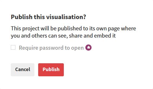
To export your visualization, click the Export & Publish icon in the top right of your screen. Then click Publish to share and embed. This will prompt you with a verification box. Click Publish to display your visualization.


Once we've clicked publish, you'll see your visualization is now displaying as publicly visible and the Export and publish box is now displaying green. If you make further changes to your visualization, you'll need to republish for the changes to take effect. Here you'll also see a link for your visualization, as well as an embed code to add this visualization to your website. An example embedded visualization of our mapping exercise is shown below.
For static visualizations, Flourish will additionally provide the ability to download as an image. Dynamic visualizations, like our network analysis examples, will not download as an image.
Additional Resources
Curious to make your own visualizations? Try working with your own data sets, or feel free to experiment with the following sample data sets. Be forewarned, both may require a little additional cleaning!
2004-2008 Conference Attendees
Although we've explored a few types of visualizations, Flourish Studio offers many more alternative and advance visualizations not covered in this tutorial. For more information on specific visualizations and features, visit the Flourish help page and blog. For inspiration for your visualizations, also be sure to visit Flourish's examples gallery and Twitter profile.
Lastly, always feel free to reach out to me with any questions. Happy visualizing!